
中间的桌子列不居中?
中间的桌子列不居中?
提问于 2021-04-12 21:13:44
我希望将列的中心放在我的表的中间,这样表标题"Information“就是以为中心的,正好位于h2标题”他的职业“之下。我发现表是以为中心的,但是列1比第3列宽
我以为这个
            <colgroup>
              <col style="width:5%">
              <col style="width:90%">
              <col style="width:5%">
            </colgroup>
会给出第1栏和第3栏相等的宽度。为什么不这样做,如何使2列的宽度相同?
我的HTML和CSS:
body {
  font-family: monospace;
  background: linear-gradient(190deg, black 50%, #001A7A);
  color: white;
  background-repeat: no-repeat;
  height: 100%;
  width: 100%;
  text-align: center;
  font-size: min(4vw, 20px);
}

h1 {
  text-align: center;
  font-size: 60px;
}

#tribute-link {
  color: #BBFEFF;
}

#image {
  display: block;
  max-width: 60%;
  height: auto;
  margin: auto;
}

#img-caption {
    font-size: 18px;
}

.career {
  font-size: 35px;
  text-align: center;
}

#tribute-companies {
  margin: auto;
  max-width: 1500px;
  height: auto;
  border-spacing: min(3vw, 50px) 50px;
}<script src="https://cdn.freecodecamp.org/testable-projects-fcc/v1/bundle.js"></script>
<body>
<main id="main">
<h1 id="title">Elon Musk</h1>
<div id="img-div">
<img src="https://upload.wikimedia.org/wikipedia/commons/e/ed/Elon_Musk_Royal_Society.jpg" id="image" alt="A picture of Elon Musk">
<p id="img-caption">Elon Musk on the Royal Society admissions day in London, July 2018</p>
</div>
<div id="tribute-info">
<table id="tribute-companies">
<h2 class="career">His career:</h2>
<colgroup>
<col style="width:5%">
<col style="width:90%">
<col style="width:5%">
</colgroup>
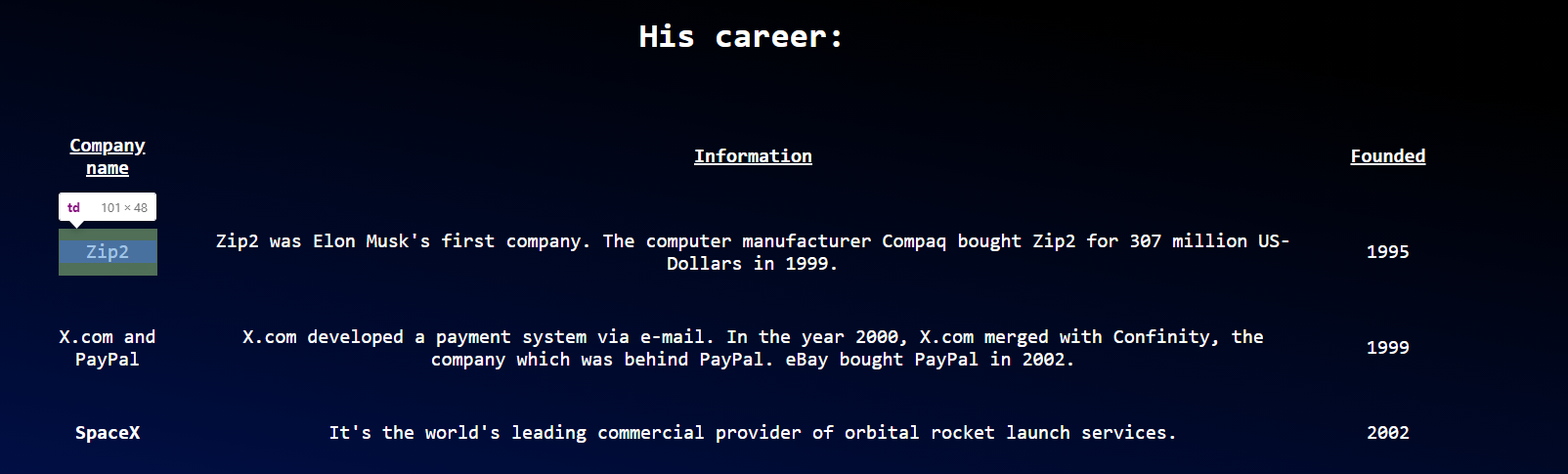
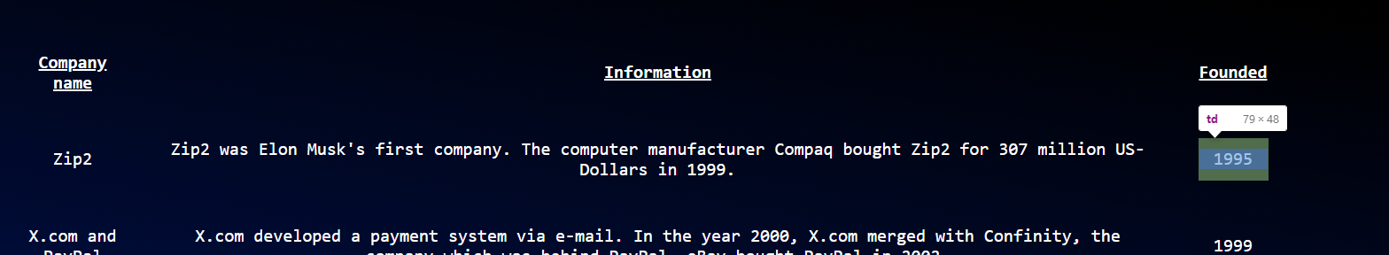
<tr>
<th><u>Company name</u></th>
<th><u>Information</u></th>
<th><u>Founded</u></th>
</tr>
<tr>
<td>Zip2</td>
<td>Zip2 was Elon Musk's first company. The computer manufacturer Compaq bought Zip2 for 307 million US-Dollars in 1999.</td>
<td>1995</td>
</tr>
<tr>
<td>X.com and PayPal</td>
<td>X.com developed a payment system via e-mail. In the year 2000, X.com merged with Confinity, the company which was behind PayPal. eBay bought PayPal in 2002.</td>
<td>1999</td>
</tr>
<tr>
<td>SpaceX</td>
<td>It's the world's leading commercial provider of orbital rocket launch services.</td>
<td>2002</td>
</tr>
<tr>
<td>Tesla</td>
<td>Elon Musk invested in Tesla in the year 2004. It has become the biggest electric vehicle company since then.</td>
<td>2003</td>
</tr>
<tr>
<td>SolarCity</td>
<td>SolarCity manufactured solar cells. It merged with Tesla in the year 2016.</td>
<td>2006</td>
</tr>
<tr>
<td>OpenAI</td>
<td>OpenAI developed artificial intelligence. Elon Musk left the project in 2019.</td>
<td>2015</td>
</tr>
<tr>
<td>Neuralink</td>
<td>Neuralink tries to connect the human brain to machines.</td>
<td>2016</td>
</tr>
<tr>
<td>The Boring Company</td>
<td>A tunnel boring company.</td>
<td>2016</td>
</tr>
</table>
<div>
<a href="https://de.wikipedia.org/wiki/Elon_Musk" id="tribute-link" target="_blank">Read more about Elon Musk on Wikipedia</a>
</body>
回答 3
Stack Overflow用户
回答已采纳
发布于 2021-04-12 21:40:41
我认为这个css一个最好的工作,如果你喜欢它时,缩小为移动。
tr td:nth-child(1), tr td:nth-child(3)
{
min-width: 101px;
}
这也有效,但它分解了文本,看起来不太好。
tr td:nth-child(1), tr td:nth-child(3)
{
word-break: break-all;
}Stack Overflow用户
发布于 2021-04-12 21:43:31
原因很明显是左列包含的单词比列的5%宽更长。在这种情况下,列将自动调整其宽度。
如果您不希望这些单词被打断(使用连字符或类似的),我建议您将第一列和第三列的宽度都扩大到相同的数目。这样,中间柱就会变窄。尝试10%/80%/10%或任何适合您特定内容的值。
Stack Overflow用户
发布于 2021-04-12 21:22:10
尝试在th和td中添加
word-wrap: break-word; 或者你可以用
word-break: break-all; 页面原文内容由Stack Overflow提供。腾讯云小微IT领域专用引擎提供翻译支持
原文链接:
https://stackoverflow.com/questions/67065763
复制相关文章
相似问题
腾讯云开发者

Copyright © 2013 - 2026 Tencent Cloud. All Rights Reserved. 腾讯云 版权所有
深圳市腾讯计算机系统有限公司 ICP备案/许可证号:粤B2-20090059  粤公网安备44030502008569号
腾讯云计算(北京)有限责任公司 京ICP证150476号 | 京ICP备11018762号