
引导表在Chrome上不能正常工作,但在Firefox上工作很好
引导表在Chrome上不能正常工作,但在Firefox上工作很好
提问于 2014-08-18 01:17:50
我用3制作了一张表格,它在一个模式内。奇怪的是,它在火狐和jsFiddle上运行得很好,但在Google上却不行。
<button class="btn btn-xs btn-default" data-toggle="modal" data-target="#competitor_modal">
Competitor
</button>
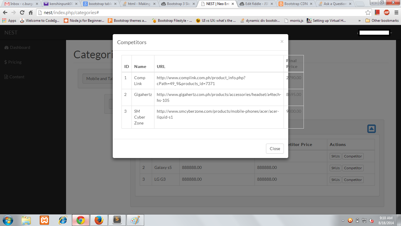
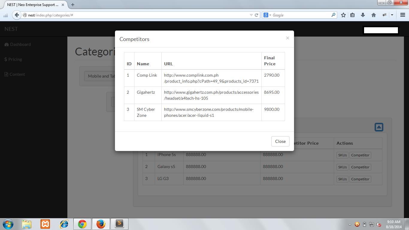
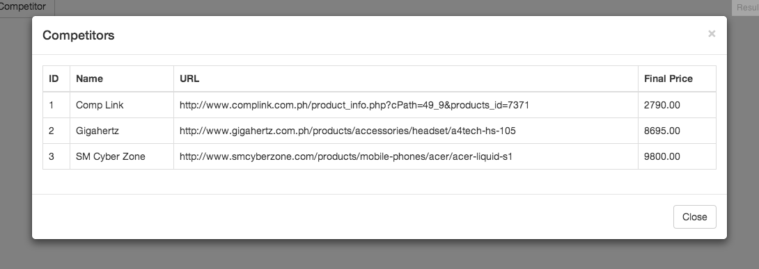
<div class="modal fade" id="competitor_modal" tabindex="-1" role="dialog" aria-labelledby="myModalLabel" aria-hidden="true">
<div class="modal-dialog">
<div class="modal-content">
<div class="modal-header">
<button type="button" class="close" data-dismiss="modal">
<span aria-hidden="true">×</span>
<span class="sr-only">Close</span>
</button>
<h4 class="modal-title" id="myModalLabel">Competitors</h4>
</div>
<div class="modal-body">
<div class="container-fluid">
<div class="row">
<div class="col-lg-12">
<div class="table-responsive">
<table class="table table-bordered">
<thead>
<tr>
<th>ID</th>
<th>Name</th>
<th>URL</th>
<th>Final Price</th>
</tr>
</thead>
<tbody>
<tr>
<td>1</td>
<td>Comp Link</td>
<td>http://www.complink.com.ph/product_info.php?cPath=49_9&products_id=7371</td>
<td>2790.00</td>
</tr>
<tr>
<td>2</td>
<td>Gigahertz</td>
<td>http://www.gigahertz.com.ph/products/accessories/headset/a4tech-hs-105</td>
<td>8695.00</td>
</tr>
<tr>
<td>3</td>
<td>SM Cyber Zone</td>
<td>http://www.smcyberzone.com/products/mobile-phones/acer/acer-liquid-s1</td>
<td>9800.00</td>
</tr>
</tbody>
</table>
</div>
</div>
</div>
</div>
</div>
<div class="modal-footer">
<button type="button" class="btn btn-default" data-dismiss="modal">Close</button>
</div>
</div>
</div>
</div>下面是jsFiddle:
http://jsfiddle.net/dsf496jw/3/
以下是一些屏幕截图。
铬:
Firefox:
回答 4
Stack Overflow用户
回答已采纳
发布于 2014-08-18 01:33:24
将该类添加到您的<table>中
.my-table {
    table-layout: fixed;
    word-wrap: break-word;
}
Updated jsfiddle
它可以在md和lg屏幕上工作,尽管它不适合移动应用。
Stack Overflow用户
发布于 2014-08-18 01:38:02
我相信Chrome并不是滚动表的粉丝,而且引导程序喜欢渲染表格来适应所有的数据。在Firefox中,它会滚动,而在chrome中则不会。
一种解决方案是将表包装在一个可滚动的div中。也许在小屏幕上触发小屏幕来修正克里斯汀的答案?
Stack Overflow用户
发布于 2014-08-18 03:49:26
演示:http://jsfiddle.net/9349fe34/
这将是更友好的用户,海事组织,使宽度自动。它很好地缩小了尺寸,响应表将在767 at断点(默认)启动。
将类.table-modal添加到模型中
<div class="modal fade table-modal" id="competitor_modal" tabindex="-1" role="dialog" aria-labelledby="myModalLabel" aria-hidden="true">增加CSS:
.table-modal .modal-dialog {width:auto;max-width:1000px;}
.table-modal {padding-left:5%;padding-right:5%;} /* put this in a 768px min-width */
并删除.row和col*-12以及模态体内的.容器流体,这是不必要的。模态体上的填充物会工作得很好。
页面原文内容由Stack Overflow提供。腾讯云小微IT领域专用引擎提供翻译支持
原文链接:
https://stackoverflow.com/questions/25355181
复制相关文章
相似问题
腾讯云开发者

Copyright © 2013 - 2026 Tencent Cloud. All Rights Reserved. 腾讯云 版权所有
深圳市腾讯计算机系统有限公司 ICP备案/许可证号:粤B2-20090059  粤公网安备44030502008569号
腾讯云计算(北京)有限责任公司 京ICP证150476号 | 京ICP备11018762号