Bulk RNA/普通转录组也能轻松完成通路活性及转录因子活性推断分析

Bulk RNA/普通转录组也能轻松完成通路活性及转录因子活性推断分析

KS科研分享与服务-TS的美梦
发布于 2026-04-29 13:45:19
发布于 2026-04-29 13:45:19
继续decoupleR的介绍。上一节介绍了对于scRNA的分析,关于通路活性以及TF活性的分析在单细胞上有很多工具,但是不能直接套用在bulk,毕竟bulk样本有限。decoupleR能够很好的弥补bulk在这方面的分析缺失。
读入数据
BULK RNA数据来源于GSE318428,数据提供了完整的counts矩阵,包括两组6个样本(n=3)。这里以此为例,使用decoupleR进行普通转录组数据通路活性分析及转录因子活性推断。
library(decoupleR)
library(dplyr)
library(tibble)
library(tidyr)
library(ggplot2)
library(pheatmap)
library(ggrepel)

setwd("/home/tq_ziv/data_analysis/R版decoupleR")counts <- read.table("GSE318428_gene_count.txt",
header = T,
sep = "\t",
row.names = 1,
stringsAsFactors = FALSE)去除重复gene name并设置为行名:
counts <- counts[!duplicated(counts$gene_name), ]
rownames(counts) <- counts$gene_name
counts <- counts[,1:6]
counts <- counts[rowSums(counts == 0) != ncol(counts), ]#去除计数都是0的基因
为了减弱测序深度等技术因素的影响,后续的分析中,需要使用标准化的矩阵(FPKM/CPM/TPM进行log转化)作为输入数据,不能直接使用原始raw counts。因为这里的输入数据是counts,所以先使用edgeR包计算一下CPM,并且取log。自己的测序数据一般提供RPKM/CPM/TPM矩阵,无需自己计算,直接log使用即可。
library(edgeR)
y <- DGEList(counts = counts)
y <- calcNormFactors(y, method = "TMM")
logcpm <- cpm(y, log = TRUE, prior.count = 1)
1、通路活性分析
获取PROGENy model,并分析通路活性。
net <- decoupleR::get_progeny(organism = 'human', #只支持“human”或者“mouse”
top = 500) #返回每条通路top n的基因bulk_acts <- decoupleR::run_mlm(mat = logcpm, #bulk 表达矩阵
net = net,
.source = 'source',
.target = 'target',
.mor = 'weight',
minsize = 5)#通路活性结果长数据转化为宽数据
sample_acts_mat <- bulk_acts %>%
tidyr::pivot_wider(id_cols = 'condition',
names_from = 'source',
values_from = 'score') %>%
tibble::column_to_rownames('condition') %>%
as.matrix()
# Scale per feature
sample_acts_mat <- scale(sample_acts_mat)
# Color scale
colors <- rev(RColorBrewer::brewer.pal(n = 11, name = "RdBu"))
colors.use <- grDevices::colorRampPalette(colors = colors)(100)
my_breaks <- c(seq(-2, 0, length.out = ceiling(100 / 2) + 1),
seq(0.05,2, length.out = floor(100 / 2)))
# Plot
pheatmap::pheatmap(mat = sample_acts_mat,
color = colors.use,
border_color = "black",
breaks = my_breaks,
cellwidth = 20,
cellheight = 20,
treeheight_row = 20,
treeheight_col = 20)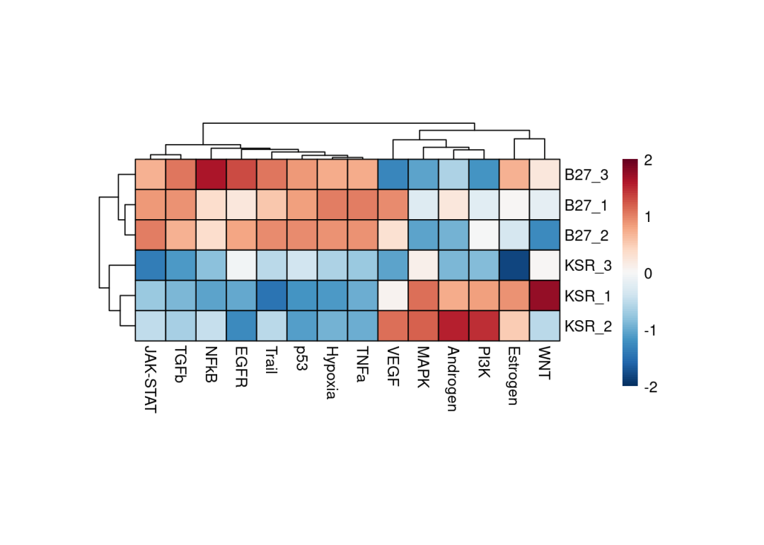
因为数据重复一致性较好,从上述的热图就能够清楚的看到,例如JAK-STAT、TGFb、P53等通路在B27组是激活的,例如MAPK、PI3K等通路在KSR组是激活的。也可以使用limma差异分析的t-value,DEseq差异分析结果的stat值推断通路活性,(edgeR包差异分析没有类似的统计值,可以通过-log10(pvalue) * logFC计算获得),能够直观的分析两组之间通路活性活性情况。
做一下差异分析结果,这里使用我们之前写过的bulk差异分析函数,包含三种方式,可以任意选择,参考Bulk RNA(普通转录组)多组差异基因分析函数(视频教程)。差异分析使用DEseq2: 这里是KSR vs B27
meta <- data.frame(KSR=c("KSR_1","KSR_2","KSR_3"),
                   B27=c("B27_1","B27_2","B27_3"))
deg_Deseq2 <- KS_bulkRNA_MultiGroup_DEGs(exprSet = counts, #DESeq2差异分析需要原始count矩阵
                                         meta = meta,
                                         methods = "DESeq2",
                                         test = "KSR",
                                         control = "B27",
                                         repNum1 = 3,
                                         repNum2 = 3)
提取stat:我筛选掉了padj是NA的基因。
# Extract state per gene
deg <- deg_Deseq2 %>%
       dplyr::filter(!is.na(padj)) %>%
       dplyr::select(stat) %>%
as.matrix()contrast_acts <- decoupleR::run_mlm(mat =deg,
net = net,
.source = 'source',
.target = 'target',
.mor = 'weight',
minsize = 5)# Plot
colors <- rev(RColorBrewer::brewer.pal(n = 11, name = "RdBu")[c(2, 10)])
p <- ggplot2::ggplot(data = contrast_acts,
mapping = ggplot2::aes(x = stats::reorder(source, score),
y = score)) +
ggplot2::geom_bar(mapping = ggplot2::aes(fill = score),
color = "black",
stat = "identity") +
ggplot2::scale_fill_gradient2(low = colors[1],
mid = "whitesmoke",
high = colors[2],
midpoint = 0) +
ggplot2::theme_minimal() +
ggplot2::theme(axis.title = element_text(face = "bold", size = 12),
axis.text.x = ggplot2::element_text(angle = 45,
hjust = 1,
size = 10,
face = "bold"),
axis.text.y = ggplot2::element_text(size = 10,
face = "bold"),
panel.grid.major = element_blank(),
panel.grid.minor = element_blank()) +
ggplot2::xlab("Pathways")
p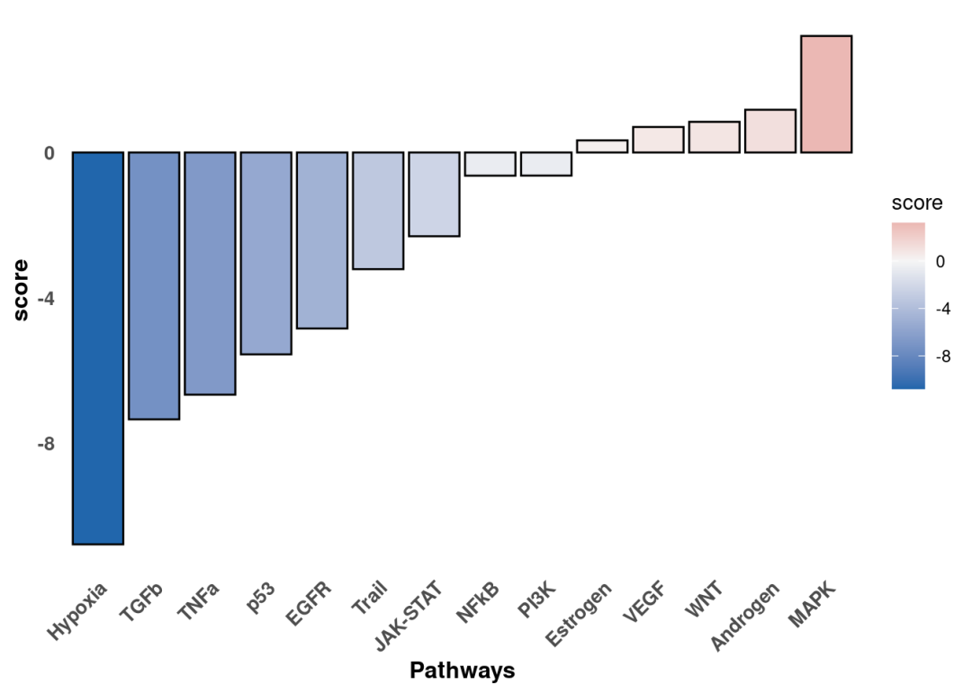
差异分析的比较是KSR vs B27。通路活性scores大于0的是在KSR组激活的通路。这个结果与热图结果一致。我们还可以沿着t/stat值进一步可视化感兴趣通路中响应最灵敏的基因,以解释结果。这里以Hypoxia为例:
pathway <- 'Hypoxia'
#提取先验数据库中感兴趣通路基因,并筛选与差异分析结果deg中交集的基因
df <- net %>%
      dplyr::filter(source == pathway) %>%
      dplyr::arrange(target) %>%
      dplyr::mutate(ID = target,
                    color = "3") %>%
      tibble::column_to_rownames('target')
inter <- sort(dplyr::intersect(rownames(deg), rownames(df)))
df <- df[inter, ]
df['stat'] <- deg[inter, ]
df <- df %>%
      dplyr::mutate(color = dplyr::if_else(weight > 0 & stat > 0, '1', color)) %>%
      dplyr::mutate(color = dplyr::if_else(weight > 0 & stat < 0, '2', color)) %>%
      dplyr::mutate(color = dplyr::if_else(weight < 0 & stat > 0, '2', color)) %>%
      dplyr::mutate(color = dplyr::if_else(weight < 0 & stat < 0, '1', color))
colors <- rev(RColorBrewer::brewer.pal(n = 11, name = "RdBu")[c(2, 10)])
p <- ggplot2::ggplot(data = df,
                     mapping = ggplot2::aes(x = weight,
                                            y = stat,
                                            color = color)) +
     ggplot2::geom_point(size = 2.5,
                         color = "black") +
     ggplot2::geom_point(size = 1.5) +
     ggplot2::scale_colour_manual(values = c(colors[2], colors[1], "grey")) +
     ggrepel::geom_label_repel(mapping = ggplot2::aes(label = ID)) +
     ggplot2::theme_minimal() +
     ggplot2::theme(legend.position = "none") +
     ggplot2::geom_vline(xintercept = 0, linetype = 'dotted') +
     ggplot2::geom_hline(yintercept = 0, linetype = 'dotted') +
     ggplot2::ggtitle(pathway)
p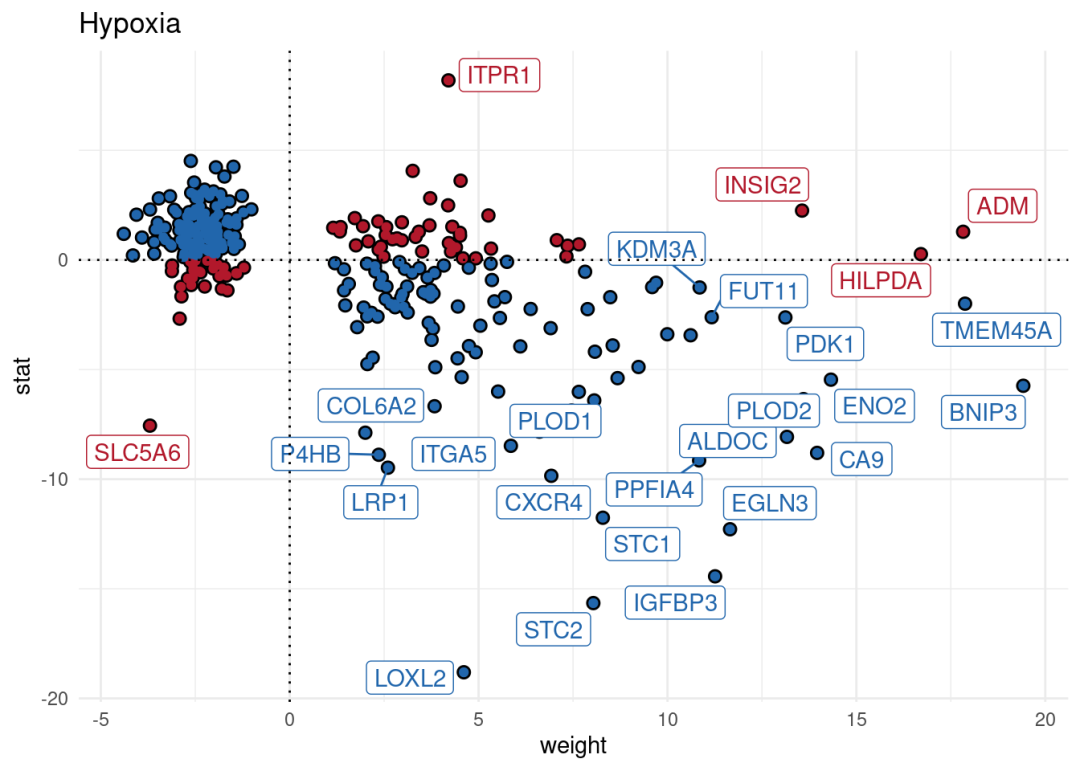
2、通路评分
除了进行通路活性分析外,bulk也能够使用decoupleR进行通路基因集评分分析,这里以hallmark为例:
#载入数据库
msigdb = decoupleR::get_resource('MSigDB')#筛选hallmark基因集
msigdb = msigdb[msigdb$collection=='hallmark',]#去重
msigdb <- msigdb[!duplicated(msigdb[c("geneset", "genesymbol")]), ]bulk_GSVA <- decoupleR::run_gsva(mat = logcpm, #bulk 表达矩阵
net = msigdb,
.source = 'geneset',
.target = 'genesymbol',
minsize = 5)#通路活性结果长数据转化为宽数据
bulk_GSVA <- bulk_GSVA %>%
tidyr::pivot_wider(id_cols = 'condition',
names_from = 'source',
values_from = 'score') %>%
tibble::column_to_rownames('condition') %>%
as.matrix()
# Scale per feature
bulk_GSVA <- scale(bulk_GSVA)
# Color scale
colors <- rev(RColorBrewer::brewer.pal(n = 11, name = "RdBu"))
colors.use <- grDevices::colorRampPalette(colors = colors)(100)
my_breaks <- c(seq(-2, 0, length.out = ceiling(100 / 2) + 1),
seq(0.05,2, length.out = floor(100 / 2)))
# Plot
pheatmap::pheatmap(mat = bulk_GSVA,
color = colors.use,
border_color = "black",
breaks = my_breaks,
treeheight_row = 20,
treeheight_col = 20)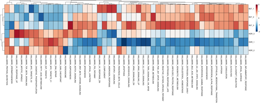
3、转录因子活性分析
转录因子通过调控下游靶基因的转录,在细胞命运决定和疾病发生发展中发挥核心作用。从转录组数据可靠地推断TF活性,成为解析细胞异质性和识别关键调控因子的关键问题。我们介绍最多,使用非常多的方法SCENIC(pySCENIC)是有效的方法,但是流程复杂,计算工作量大,且对于普通bulk RNA数据效果不好(样本量不足)。decoupleR利用利用现成网络+多算法打分,进行单细胞及BULK转录组数据的转录因子活性推断。数据库来源于先验知识,使用CollecTRI network,其中包含从12个不同来源精心整理的转录因子及其转录靶点的集合,是DoRothEA(DoRothEA: collection of human and mouse regulons) 网络的拓展,但是与其和其他基于文献的基因调控网络相比,该集合提供了更广泛的转录因子覆盖范围,并且在识别受干扰的转录因子方面表现更优。与DoRothEA类似,相互作用根据其调节模式(激活或抑制)进行加权。转录因子合集可以通过decoupleR函数get_collectri进行获取,其中参数split_complexes 用于保留复合物或将其拆分为亚基,默认情况下,建议保留复合物。
tf_net <- decoupleR::get_collectri(organism = 'human', #物种human or mouse
split_complexes = FALSE)sample_tfs <- decoupleR::run_ulm(mat = logcpm,
net = tf_net,
.source = 'source',
.target = 'target',
.mor = 'mor',
minsize = 5)sample_tfs_mat <- sample_tfs %>%
tidyr::pivot_wider(id_cols = 'condition',
names_from = 'source',
values_from = 'score') %>%
tibble::column_to_rownames('condition') %>%
as.matrix()n_tfs <- 30
# Get top tfs with more variable means across clusters
tfs <- sample_tfs %>%
dplyr::group_by(source) %>%
dplyr::summarise(std = stats::sd(score)) %>%
dplyr::arrange(-abs(std)) %>%
head(n_tfs) %>%
dplyr::pull(source)
sample_tfs_mat <- sample_tfs_mat[,tfs]
# Scale per sample
sample_tfs_mat <- scale(sample_tfs_mat)
# Choose color palette
colors <- rev(RColorBrewer::brewer.pal(n = 11, name = "RdBu"))
colors.use <- grDevices::colorRampPalette(colors = colors)(100)
my_breaks <- c(seq(-2, 0, length.out = ceiling(100 / 2) + 1),
seq(0.05, 2, length.out = floor(100 / 2)))
# Plot
pheatmap::pheatmap(mat = sample_tfs_mat,
color = colors.use,
border_color = "black",
breaks = my_breaks,
cellwidth = 15,
cellheight = 15,
treeheight_row = 20,
treeheight_col = 20)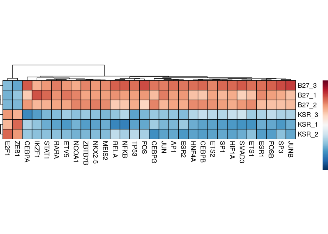
同样的,TF活性推断分析也可以使用差异分析结果进行分析:
# Run ulm
contrast_tfs <- decoupleR::run_ulm(mat = deg[, 'stat', drop = FALSE],
                                    net = tf_net,
                                    .source = 'source',
                                    .target = 'target',
                                    .mor='mor',
minsize = 5)# Filter top TFs in both signs
f_contrast_acts <- contrast_tfs %>%
arrange(desc(score)) %>%
mutate(rank = row_number()) %>% # 添加排名列
filter(rank <= 15 | rank > n() - 15) %>%
mutate(position = ifelse(rank <= 15, "top", "bottom"))
colors <- rev(RColorBrewer::brewer.pal(n = 11, name = "RdBu")[c(2, 10)])
p <- ggplot2::ggplot(data = f_contrast_acts,
mapping = ggplot2::aes(x = stats::reorder(source, score),
y = score)) +
ggplot2::geom_bar(mapping = ggplot2::aes(fill = score),
color = "black",
stat = "identity") +
ggplot2::scale_fill_gradient2(low = colors[1],
mid = "whitesmoke",
high = colors[2],
midpoint = 0) +
ggplot2::theme_minimal() +
ggplot2::theme(axis.title = element_text(face = "bold", size = 12),
axis.text.x = ggplot2::element_text(angle = 45,
hjust = 1,
size = 10,
face = "bold"),
axis.text.y = ggplot2::element_text(size = 10,
face = "bold"),
panel.grid.major = element_blank(),
panel.grid.minor = element_blank()) +
ggplot2::xlab("TFs")
p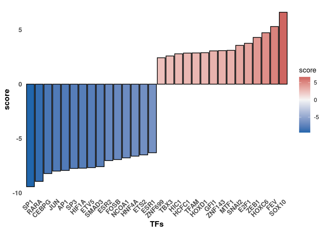
最后可以关注下变化的TF其调控的靶向基因哪些具有最大的差异变化。比如这里这里可以看到,SOX10在KSR组是激活的。使用火山图可视化显著变化的把基因。筛选显著变化的SOX10把基因:
#差异显著变化基因:
sig_gene <- deg_Deseq2[deg_Deseq2$log2FoldChange >=0.5 & deg_Deseq2$padj <= 0.05,]
#筛选SOX10把基因
tf <- 'SOX10'
df <- tf_net %>%
      dplyr::filter(source == tf) %>%
      dplyr::arrange(target) %>%
      dplyr::mutate(ID = target, color = "3") %>%
      tibble::column_to_rownames('target')
inter <- sort(dplyr::intersect(rownames(sig_gene), rownames(df)))
#添加logFC及p值
sig_target <- deg_Deseq2[inter, ]
sig_target$gene <- rownames(sig_target)library(ggplot2)
library(ggrepel)
ggplot(deg_Deseq2, aes(x=log2FoldChange, y=-log10(padj))) +
geom_hline(aes(yintercept=1.3), color = "#999999", linetype="dashed", size=1) +#添加横线
geom_vline(aes(xintercept=0), color = "#999999", linetype="dashed", size=1) + #添加纵线
geom_point(data = deg_Deseq2[deg_Deseq2$padj <0.05&(deg_Deseq2$log2FoldChange >0.5),], stroke = 0.5, size=2, shape=16, color="red",alpha =0.4) + #将指定上调基因颜色定为红色,设置透明
geom_point(data = deg_Deseq2[deg_Deseq2$padj <0.05&(deg_Deseq2$log2FoldChange < -0.5),], stroke = 0.5, size=2, shape=16,color="blue",alpha =0.4) + #将指定上调基因颜色定为蓝色,设置透明
geom_point(data = sig_target, stroke = 0.5, size=4, shape=16,color="olivedrab3") + #要显示基因名的点设置突出颜色,点设置稍微大点
labs(x = "Log2 fold change",y = "-Log10(P-value)", title = "") + #标题横纵轴名称
theme_bw() + #下面就是ggplot主题修饰
theme(panel.grid.major = element_blank(), panel.grid.minor = element_blank(),
panel.border = element_rect(size=1, colour = "black")) +
theme(axis.title =element_text(size = 14),axis.text =element_text(size = 8, color = "black"),
plot.title =element_text(hjust = 0.5, size = 16)) +
theme(legend.position = "none") + #不要放置legend
geom_text_repel(data=sig_target, aes(label=gene), color="black", size=4, fontface="italic", #标签设置,颜色、大小、字体、指示箭头设置
arrow = arrow(ends="first", length = unit(0.01, "npc")), box.padding = 0.2,
point.padding = 0.3, segment.color = 'black', segment.size = 0.3, force = 1, max.iter = 3e3)+
ggtitle("Target genes of SOX10")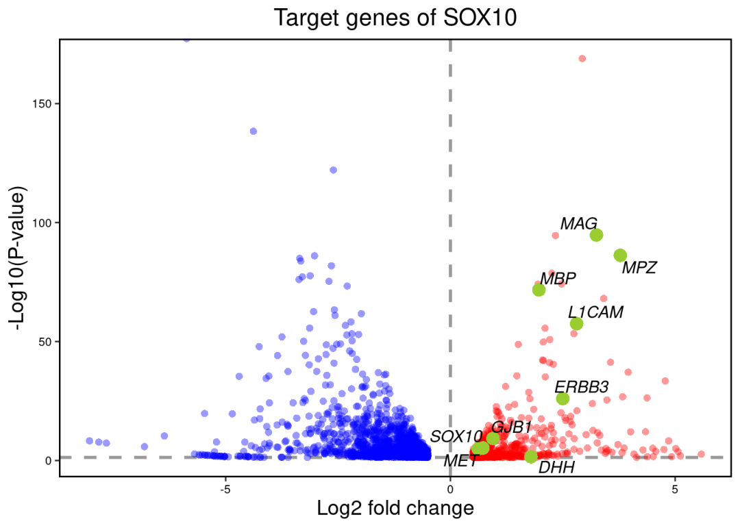
觉得我们分享有用的点个赞再走呗!
本文参与 腾讯云自媒体同步曝光计划,分享自微信公众号。
原始发表:2026-04-27,如有侵权请联系 cloudcommunity@tencent.com 删除
评论
登录后参与评论
推荐阅读
目录
腾讯云开发者

Copyright © 2013 - 2026 Tencent Cloud. All Rights Reserved. 腾讯云 版权所有
深圳市腾讯计算机系统有限公司 ICP备案/许可证号:粤B2-20090059 ![]() 粤公网安备44030502008569号
粤公网安备44030502008569号
腾讯云计算(北京)有限责任公司 京ICP证150476号 | 京ICP备11018762号